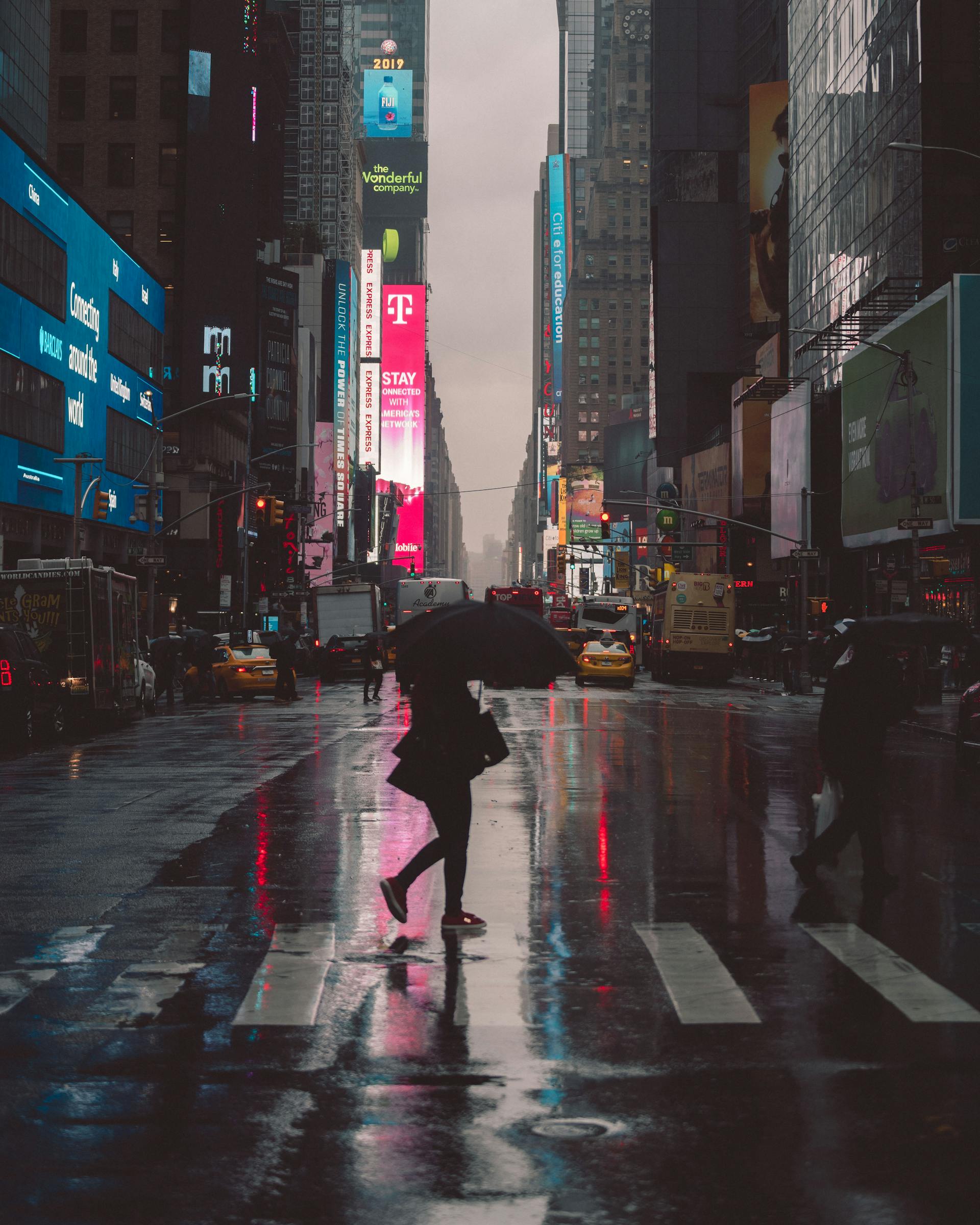
Billboards are a unique kind of canvas. Unlike online ads or print layouts that people can examine up close, billboards are viewed from a distance—often at high speed and in brief glances. That makes designing them a very different challenge. Every decision, from font size to color contrast, needs to account for the reality of viewing from dozens or even hundreds of feet away.
In the world of outdoor advertising, how a billboard looks is just as important as what it says. A clever message or catchy slogan can go to waste if it’s lost in poor design. To get a billboard to not only be seen but also remembered, designers have to master a specific set of visual strategies aimed at one key goal: clarity at a distance.
Here’s how the best billboard designers do it—and what you should consider if you want your message to stand tall (and readable) from afar.
1. Start with a Clear, Singular Message
The most effective billboards deliver one core idea. Unlike other marketing platforms, billboards don’t give you the luxury of time or attention. You have about 6–8 seconds to make your point—often less if your viewer is in a moving vehicle.
That’s why the first rule of billboard design is clarity. Think of your message like a headline: quick, punchy, and easy to digest. Whether it’s “Now Open – Exit 212,” “Fast Wi-Fi for Your Road Trip,” or “Try the New Bacon Melt at Joe’s Diner,” a single, focused message gets remembered. Anything more complex risks being ignored altogether.
2. Font Size Matters (A Lot)
If your billboard text can’t be read from the road, your ad fails—simple as that. Unlike digital or print media, you can’t zoom in. Designers need to use large, bold typography that stands up to distance.
A general rule of thumb? For every 10 feet of viewing distance, use at least 1 inch of letter height. So, if your billboard is 500 feet from the average viewer, your text should be around 50 inches tall. That might sound extreme, but it’s necessary for visibility, especially on highways.
Sans-serif fonts like Helvetica, Arial, or Futura tend to work best for billboard design because of their clean lines and high legibility.
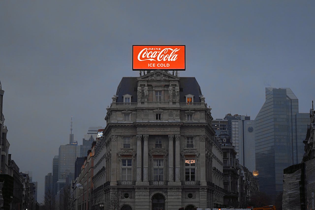
3. Stick to High Contrast Color Schemes
Colors aren’t just about branding—they’re also about legibility. If your text blends into the background, you’ve lost your audience. That’s why billboard designers often lean into bold, high-contrast color pairings: black on yellow, white on red, blue on white, and so on.
Avoid placing similar tones together, like red on orange or gray on black. They may look sleek in a design mockup but become illegible from a distance or in poor lighting. Also, consider how your billboard will appear at different times of day or in varying weather conditions. A great design should hold up whether it’s sunny, overcast, or lit by car headlights at night.
4. Use Images that Speak Loudly (and Clearly)
Images on billboards need to work instantly. Unlike a magazine ad, no one’s going to lean in and study the details. A photo or illustration should support the message—not distract from it.
Large, simple visuals with strong focal points are most effective. Think a giant cheeseburger to advertise a local diner, or a happy family in a car for an auto insurance company. Abstract, busy, or highly detailed images are harder to interpret at a glance and from a distance.
Also, don’t rely on small logos or intricate graphics. Even if they look great in the design file, they may disappear entirely in real-world conditions.
5. Keep the Word Count to a Minimum
Brevity is more than just a design principle—it’s a survival rule for billboards. A long sentence simply won’t be read at 60 miles per hour. The best billboards aim for six words or fewer. Some of the most memorable billboard ads in history have said even less.
For example:
- “Got Milk?”
- “Think Different.”
- “Vegas Baby!”
Each one communicates a powerful idea in just a few words. Aim for that kind of punchy minimalism. If you find yourself writing paragraphs, it’s a sign the message needs refining.
6. Understand the Viewing Environment
Designing for a billboard isn’t done in a vacuum. Where the ad is located can impact how it should be designed. A downtown billboard surrounded by tall buildings has different visibility needs than a rural one on an open highway.
You should also consider the billboard’s angle, elevation, and surrounding distractions. Will there be trees partially blocking the view? Is it positioned on a curve where drivers only see it briefly? Is it lit at night? These details matter, and the most effective designers work with them, not against them.
7. Leverage Branding Without Overloading
It’s tempting to cram in every brand element—logo, website, slogan, contact info, social handles—but restraint almost always wins out. Pick the most important brand identifier and make it stand out. Often, the logo and a website or simple call to action (“Visit SmithAuto.com” or “Exit 19 – Open 24/7”) is plenty.
The goal isn’t to tell your brand’s full story—it’s to spark recognition and prompt action. If the design does its job, the viewer will remember the name and look it up later.
8. Test It Before It Goes Up
Even experienced designers benefit from testing how a billboard will look in the real world. Print out your design and view it from across the room. Shrink it to the size of a business card and see what elements still stand out. Better yet, use a mockup tool or rendering software to place it in a realistic environment.
This kind of testing can reveal what’s working and what’s not, helping you make adjustments before going live.
Final Thoughts
Billboards may be old-school, but their effectiveness is anything but outdated—if they’re designed well. Creating a great billboard is a delicate blend of art and practicality, bold creativity and hard-nosed clarity. It’s about capturing attention in the real world, where distractions are plenty and time is short.
So next time you pass a billboard and actually take notice, remember—it wasn’t by accident. That was smart, strategic design working from a distance.